microframe.js is a small, lightweight and dependency-free lightbox and full-screen gallery effect for images, videos, and custom HTML content, written in vanilla JavaScript. It weighs in at around 2.5kB when gzipped (js + CSS), and the script itself is a single, self-contained file of roughly 300 lines of clean, object-oriented code, released under the MIT License.
It has been tested across several desktop and mobile browsers, but it is not yet battle-tested and intentionally avoids the heavy defensive programming that would make it bullet-proof. In exchange, it is significantly easier to read and extend. Compared to GLightbox or Lightbox2, microframe.js aims for a middle ground between the customizability and the completeness of features of the former and the ease of use of the latter.
It is designed to fit two main use cases: the small website or blog owner who wants a modern, stylish yet easily customizable lightbox for images and videos with minimal effort, and the developer who wants a clean, well-structured base for more complex projects.
Try it below!
Single Media
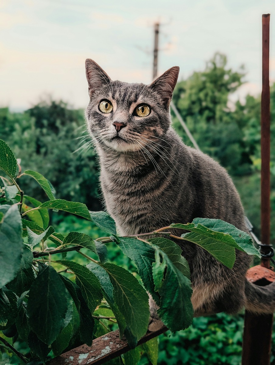
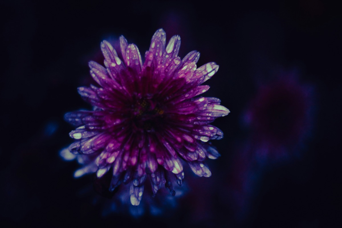
Simple Image
Clicking (or tapping on mobile) any image will open it in microframe. While in the microframe, clicking (or tapping) anywhere, or pressing ESC, will close it. Both opening and closing use a smooth, customizable fade transition. This behavior is applied automatically to all images and videos on the page
<img src="url/img.jpg"/>
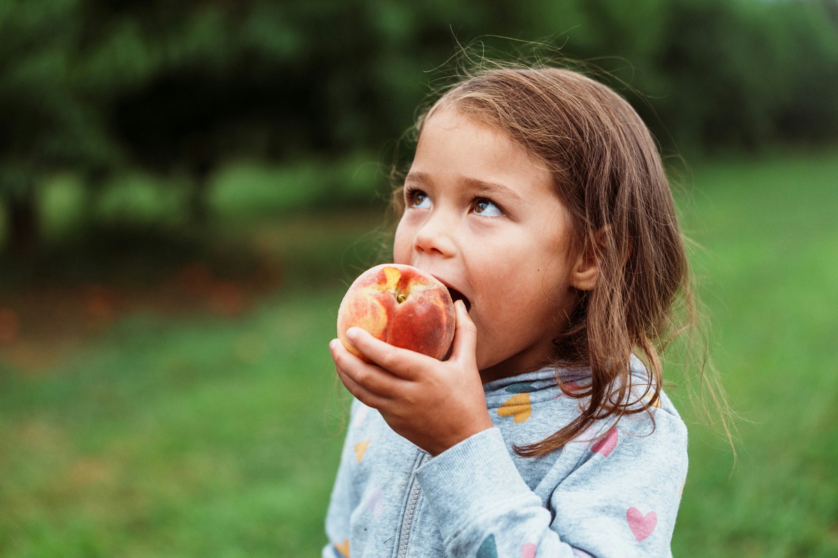
Caption
By default, microframe.js displays a caption below the media: for images it uses the alt text, and for videos it uses the title attribute. This can be easily disabled.
<img
  src="url/img.jpg"
  alt="caption"
/>
Excludind Media
By default, microframe.js will be triggered by a click on any media on the page. You can exclude specific elements from being microframed by adding class="no-microframe" to the element. Click on the image below: nothing happens. The class name that disables microframe is fully customizable.
<img
  class="no-microframe"
  src="url/img.jpg"
/>
Videos
microframe.js works seemlessly with both images (<img>) and videos (<video></video>). If a video has controls enabled, the browser's native controls take priority and it will not be microframed when clicked.
Animated GIFs or other short looping clips work just as you'd expect.
<img src="url/gif.gif"/>
Automatic Scaling
If a single image source is provided, it will display at full resolution if the viewport is large enough. On smaller screens, the image is automatically scaled down to fit, respecting customizable margins. You can override this behavior with some simple CSS.
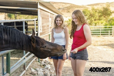
If a srcset is provided, microframe.js lets the browser automatically select the most appropriate source for the current viewport. Notice the resolution of the image below before opening it. Open it and look at the new resolution. Close it and narrow your browser window so the page displays as a single column, then open it again. microframe.js will use a smaller image size, but still big enough to fit the smaller viewport.
<img
  srcset="
    media/img-400w.jpg 400w,
    media/img-1200w.jpg 1200w,
    media/img-2000w.jpg 2000w
  "
  sizes="400px"
  src="url/img-400w.jpg"
  alt="Notice the picture size (bottom right corner)"
/>
Dynamic Pointers on Desktop
With the included CSS, the pointer gives helpful visual cues. Hover over any media: the cursor changes to zoom-in when Microframe can be opened. Once a media element is microframed, the cursor becomes zoom-out. For videos, the cursor changes to zoom-out anywhere on the overlay, but remains the standard pointer when hovering directly over the video controls.
Arbitrary Content
Any HTML block can be made microframe-able by adding class="microframe". For this example, we’ve applied it to a wide <pre><code> block. Notice how the microframed version expands to fit the content, avoiding horizontal scrolling.
// QuickSort Implementation in JavaScript
// This code sorts an array in ascending order using the QuickSort algorithm.

/**
 * partition function:
 * This function takes the last element as pivot, places the pivot element at its
 * correct position in the sorted array, and places all smaller elements to the left
 * of the pivot and all greater elements to the right.
 */
function partition(arr, low, high) {
    // Choose the last element as pivot
    let pivot = arr[high];

    // i keeps track of the position of the last element smaller than pivot
    let i = low - 1;

    // Iterate over the array from low to high - 1
    for (let j = low; j <= high - 1; j++) {
        // If current element is smaller than pivot
        if (arr[j] < pivot) {
            i++; // move the boundary of smaller elements forward

            // Swap arr[i] with arr[j] so that arr[i] now contains the smaller element
            [arr[i], arr[j]] = [arr[j], arr[i]];
        }
    }

    // After finishing the loop, place the pivot after the last smaller element
    [arr[i + 1], arr[high]] = [arr[high], arr[i + 1]];

    // Return the pivot index
    return i + 1;
}

/**
 * quickSort function:
 * Recursively sorts the array using the partition function.
 */
function quickSort(arr, low, high) {
    // Base case: if the subarray has one or zero elements, it's already sorted
    if (low >= high) return;

    // Partition the array and get the pivot index
    let pi = partition(arr, low, high);

    // Recursively sort the subarray before the pivot
    quickSort(arr, low, pi - 1);

    // Recursively sort the subarray after the pivot
    quickSort(arr, pi + 1, high);
}
<pre class="microframe" ><code>
  Your code here
</code></pre>
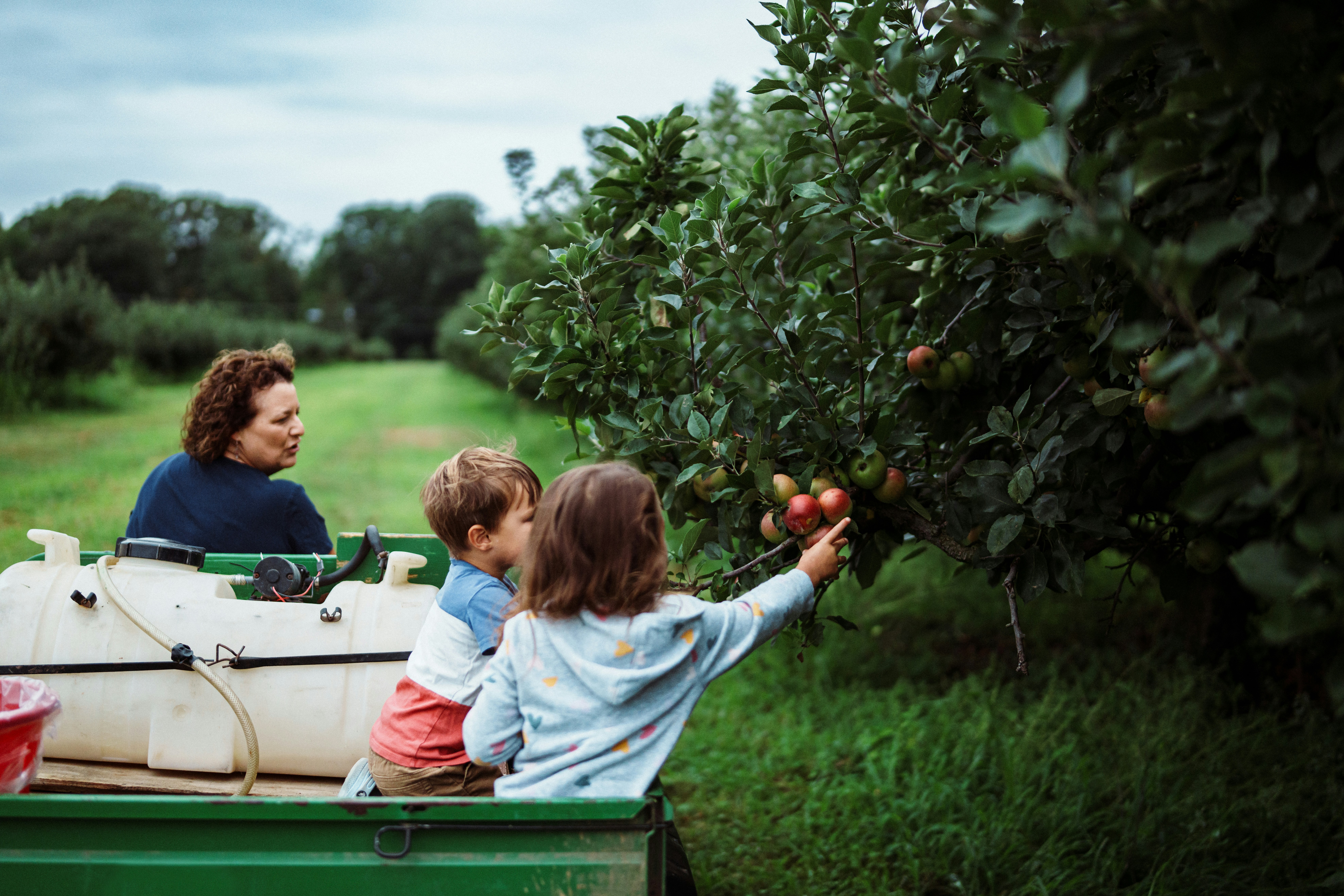
Gallery Mode
Gallery Mode
Wrapping your media in a container with class="gallery" (customizable) enables gallery mode. In this mode, you can use the left and right arrow keys (or swipe horizontally on mobile) to navigate between media elements. Click on this card and browse through the slideshow to explore the basic features of gallery mode!
When you first open a gallery, a small navigation hint appears at the bottom of the screen. The text is platform-specific and can be disabled using the options. By default, the hint shows for 5 seconds or until the user starts navigating. Close this microframe and reopen a gallery to see it in action!
Swipe left/right to navigate
Use ← / → to navigate
Counter
A counter appears at the bottom-right corner of the viewport, showing your current position in the gallery and the total number of items.
6/6
Installation
Microframe.js is a lightweight ES Module. Link it in your html/template
<!-- HTML -->
<head>
  <link rel="stylesheet" href="https://cdn.jsdelivr.net/gh/UnrequitedEcho/microframe.js/dist/microframe.min.css">
</head>

<body>
  <script type="module">
    import { initMicroframe } from 'https://cdn.jsdelivr.net/gh/UnrequitedEcho/microframe.js/dist/microframe.min.js';
    initMicroframe(); // Initialize microframe.js with default options
  </script>
<body>
That's it!
Configuration
initMicroframe() accepts an optional configuration object. All options are optional. The defaults shown below will be used if omitted.
initMicroframe({
  // Which elements can open Microframe when clicked
  selector: "img, video, .microframe",

  // Elements with this class will be ignored
  ignoreClass: "no-microframe",

  // Parent containers that should be treated as galleries
  gallerySelector: ".gallery, .media-group",

  // Show navigation hint on open
  showNavHint: true,

  // Show the current index (e.g. 3 / 12)
  showCounter: true,

  // Control when legends (alt / title text) are shown:
  // "all"   -> images and videos
  // "image" -> images only
  // "video" -> videos only
  // "none"  -> never show legends
  showLegend: "all"
});
In addition, you can customize microframe.js’ appearance and behavior by overriding the default microframe.css, either by editing it directly if you host it yourself, or by including your own CSS after the default file.
#microframe {
  /* Modal */
  --anim-duration: 0.3s;                /* Fade duration for opening / closing */
  --media-size: 90;                     /* Max media size (in vw / vh) */
  background: rgba(0, 0, 0, 0.85        /* Modal background, semi-transparent by default */

  /* Gallery UI */
  --slide-duration: 0.3s;               /* Duration of slide + fade between panels */

  /* Side panel transforms
   These define the resting position of the hidden previous / next panels */
  --panel-offset-x: 50vw;               /* Horizontal offset (0 = centered) */
  --panel-offset-y: 0%;                 /* Vertical offset (0 = centered) */
  --panel-scale: 0.8;                   /* Scale factor (1 = no scaling) */
  --panel-rot: 0deg;                    /* 2D rotation (0deg = none) */
  --panel-tilt: 0deg;                   /* 3D tilt angle (coverflow-style effect) */
  perspective: 2000px;                  /* Change this for more/less perspective effect when using --panel-tilt*/
}
Look below for more on the slide animation properties. You can also easily customize the caption.
#microframe .panel .legend {
  font-family: inherit;                 /* Caption font */
  color: white;                         /* Caption color */
  text-align: center;
  margin-top: 10px;                     /* Space between the media and the caption */
  text-shadow: 0 0 5px rgba(0,0,0,1);
}
By default, microframed elements have width: auto; and height: auto;, allowing them to shrink as much as possible without scroll bars. You can override this behavior for specific elements/classes.
This element will shrink when microframed
This element will stay the same size when microframed
This element will grow when microframed
<!--html-->

<div style="display: flex; gap: 1rem">
	<div class="elem-shrink microframe">This element will shrink when microframed</div>
	<div class="elem-stable microframe">This element will stay the same size when microframed</div>
	<div class="elem-grow microframe">This element will grow when microframed</div>
</div>
In gallery mode, microframe.js initializes three panels: the active one centered in the viewport, and two hidden panels positioned on each side. The initial position of these hidden panels is defined entirely in CSS. Navigation animations are triggered by swapping CSS classes, letting the browser handle the transitions using GPU-accelerated transforms. There are no JavaScript-driven animations involved.
Customizing the default animation is very straightforward. In most case you should get your desired effect by overriding/editing the available CSS custom properties. For asymmetric or more complex effects, you can adjust .panel.staging-left and .panel.staging-right.
The modifications you make below will apply to the whole page. To get back to the defaults, press the Default button.
Click on any element of this gallery (or open any gallery on this page) preview your animation settings !